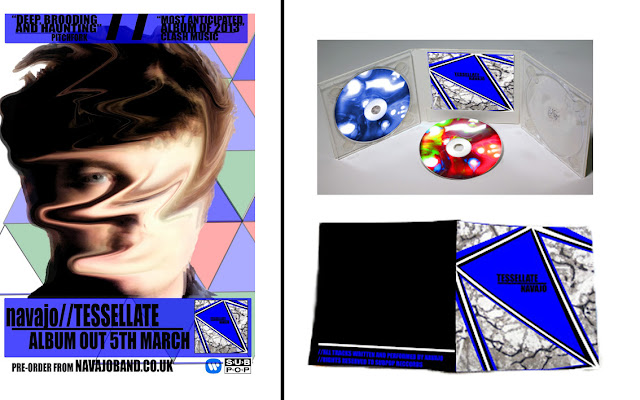
As Alex
explained, the constant underpinning of the video and
my ancillary texts was psychedelic imagery and geometric
shapes. This was also brought up from the audience feedback I
received from the AS Media class that I was given feedback from. The constant
colours of green, blue and red are seen throughout, on video, advert and
digipak (especially the disks). This is an example of how colour scheme is
utilised throughout a media product.
Continuing
the idea of colours and imagery, the element of water and fluidity is seen.
This was connected to the narrative of the video and lyrics of the song, with
reference to 'seals', 'sharks' and swimming. The imagery used in the video
purposely replicates this idea of water as an element that
is suppressing our protagonist and giving a sense of drowning and
struggling to get to the surface. The fluidity of the disks that I have created
give this connotation. Additionally, the ambiguous texture on the cover
of the digipak could represent the waves of a river or of the sea, foaming.
Finally, the connotation of fluids continues on to the texture of the magazine,
as Sam's face looks as though it is 'dripping' away.
The
geometric, triangular patterns and reference to the number three is used
constantly throughout all three texts. The video utilises the composition of
the frame, where Fran tends to be center frame with Sami and Sam
either side of her, denoting this concept of a 'love triangle'. Towards the end
of the video, the protagonist Sam draws a triangle, making it obvious
that the three characters are involved in this. Geometric graphics are used
behind Sam on the magazine advert, yet actually in a tessellation patter
working with the theme of the video and the 'toe to toe' / 'back to back' lyric
denoting Joe Newman's explanation of the song being about 'intimate
embraces'. The triangle geometry of the digipack artwork is also a tessellation
pattern yet zoomed in on to one specific triangle with the artists name and
title of the album itself.
With Sub Pop Records as my designated record label to release this digipak with, this means that Warner will be the distributors of the album. This means that I would be able to utilise the media giant Warner Brothers' other media departments, which would be an example of synergy. I could release the second disc available with the digipak as a DVD (which was my original plan) and use their Home Entertainment arm to also produce and distribute this extra disk of film footage. On this DVD would be the music video for 'Tessellate', thus the coherency of using the many factions of a major media institution to display many of my texts.
No comments:
Post a Comment