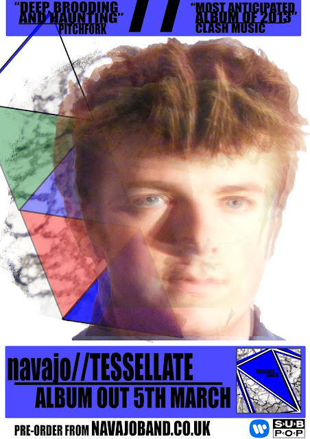
As a starting point, I decided to use aspects of my digiPak to also relate to my magazine advert, as well as also having some relevance to the song 'Tessellate'. Still using the idea of textures, I took the design that was used for the artwork (the grey tiles) and adapt it slightly to be relevant to my advert. Here is the first draft:
After asking for peer feedback of this advert as well as taking my own personal evaluation into consideration, I decided that this cover had the basic conventions of an advert: using outsider's reviews to positively publicise the album, individual visual artwork, release date, title of artist and album and record label/distributors. Yet this design was too 'washed out' with no logical meaning for the location of the tile texture of the placement of the tessellation line.
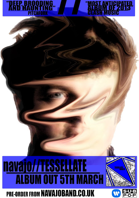
Using still the basic template of this layout, I was to simply change the visuals on the center of the advert, yet still conforming to using elements from my previous work. With this in mind, I developed this second draft:
This advert is significantly more abstract than the previous one, distorting the whole image of the model, Sam, as opposed to just altering opacity. This distorted image visually relates to the 'haunting' sound of the song. As well as simply relating to the haunting sound of the song, this follows a certain house style of textures; look at the disks of my digiPak then look at this, there is a certain resemblance in the blotted texture. With contextual understanding of the title track 'Tessellate', as well as the music video which denotes emotions of loss of identity and an emptiness of the protagonist, which me and Kate have attempted to visually capture. This distorted effect that I used Photoshop to make questions the identity of the protagonist in the music video: is he completely distorted and disfigured due to the heartbreak experiences in 'Tessellate' or will he recover himself from this slowly blurring life that he wishes to leave in the past, which is shown as if this blurring is dissapearing to the left off the page and into the past. The ghosting effect that I procuded from layering one image on top of another creates an 'ghosting' effect, again bringing about the there of haunt and mere existance emotionally.
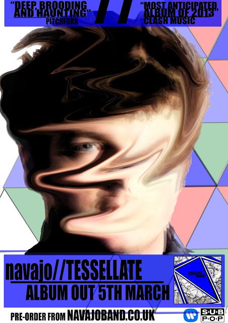
Despite my personal preference being this advert, I still thought that it was lacking certain details and was showing too much white space. To solve this, I again adapted concepts used in the music video as well as the first draft of the magazine advert for this album release and duplicated the tesselation line numerous times to create a tiling and almost completed tesselation pattern. Even better still, the pattern uses the colours that are seen throughout the music video to represent different characters: green red & blue. Here is the final draft:
This is the image that will be used in a magazine as an advert for the release of my digiPak. As stated previously, it follows the same colour scheme and uses again this same blotted texture. There is also a significant relationship shown between the geometric shapes on the artwork of the album cover and on this.
This advert sticks to the conventions of the album release advert discussed in the previous post. I have the name of the band in bold, to make it prominent and stand out to the audiance; I have given a date of the release of the album as well as a prompt to the audiance to 'pre-order'; I have left the record label and distribuers logos at the bottom left of the page; I have displayed the artwork to the album; I have given recommendation from outside reviews.


No comments:
Post a Comment